[004]
Pantry
Reducing food waste with smart shopping & inventory management
2024–Present
Role
Creator
Disciplines
Mobile App Design
Design System
Brand Identity
Current Version
v1.1
Pantry (working name) is an ongoing personal project. It's an app designed to help users reduce food waste and save money by creating shopping lists linked to inventory, and by tracking the expiry and stock of items stored throughout households. Users can also check the storage and price history of items to help them shop smarter.
Background
Using produce and other food items in your household before they expire can feel like a race against the clock.
The idea for Pantry started when I wished I could receive notifications for food that was expiring, and have recipes suggested to me with food I had at home.
After the seed was planted, and the idea grew, I searched the app store and beyond for similar apps – and I found a lot. But, I was not discouraged – though my idea was not novel, my mission became more to create the best-designed app that would make these tasks as easy as possible, and a joy to use.
Research
I opted to design the app to be flexible enough to be simplified down to shopping lists optimized for groceries, or up to including full inventory management, meal plans, and recipes that could be changed in a settings area at any time.
The fact that Pantry wouldn't be the first of its kind had its benefits – I could analyize existing apps and read reviews to find out where they fell short for some users. And so, I did just that. These learnings were useful to keep in mind when crafting the design principles and throughout the design process.
Key takeaways
Item Categories that can be created and modified
Managable Common Items and Saved Items
Items that include Tags, Notes, and Expiry Date
Shopping lists that can be manually re-ordered
Functionality to print lists and move items
Robust statistics
Customizable Inventory lists and additional storage spaces
Solution
iOS app
I crafted a set of design principles at the beginning of the design process to guide my thinking.
Agility Before Detail
Allow users to perform actions with the minimum amount data possible.
Highly Reusable
Users should only have to detail something once.
Highly Configurable
From a simple grocery list to full inventory management and beyond.
Use Data Effectively
Use the data users' input to the maximum effect.
Organizing storage spaces
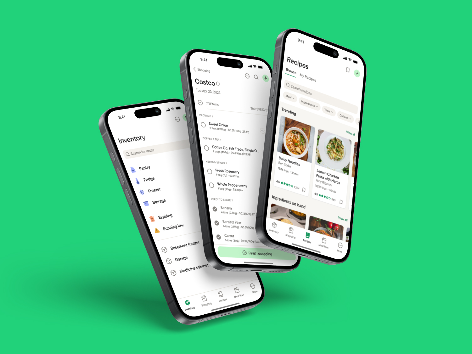
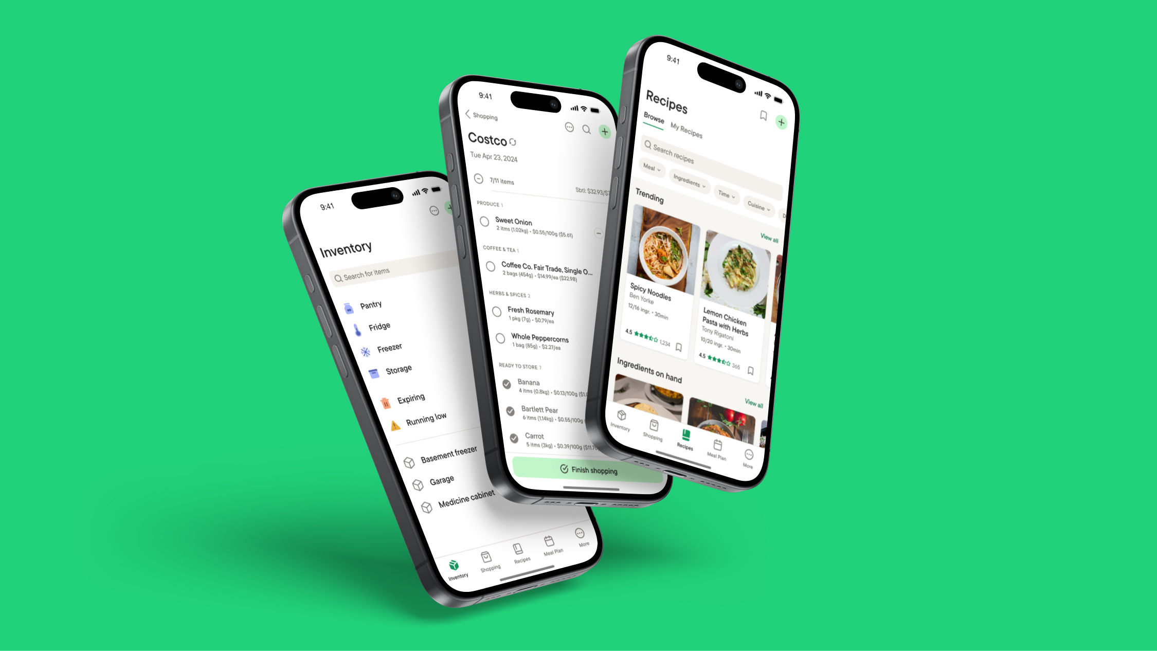
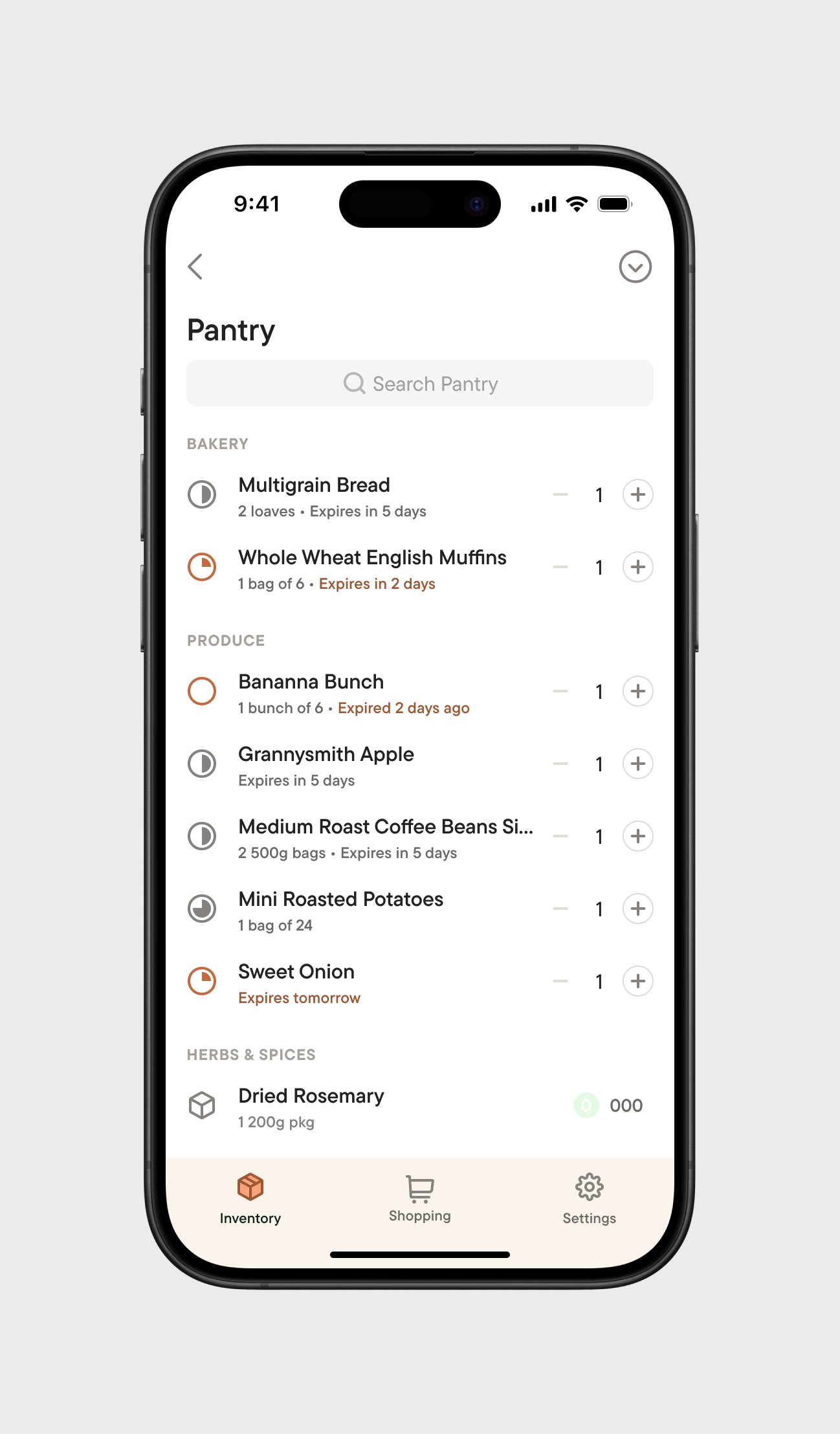
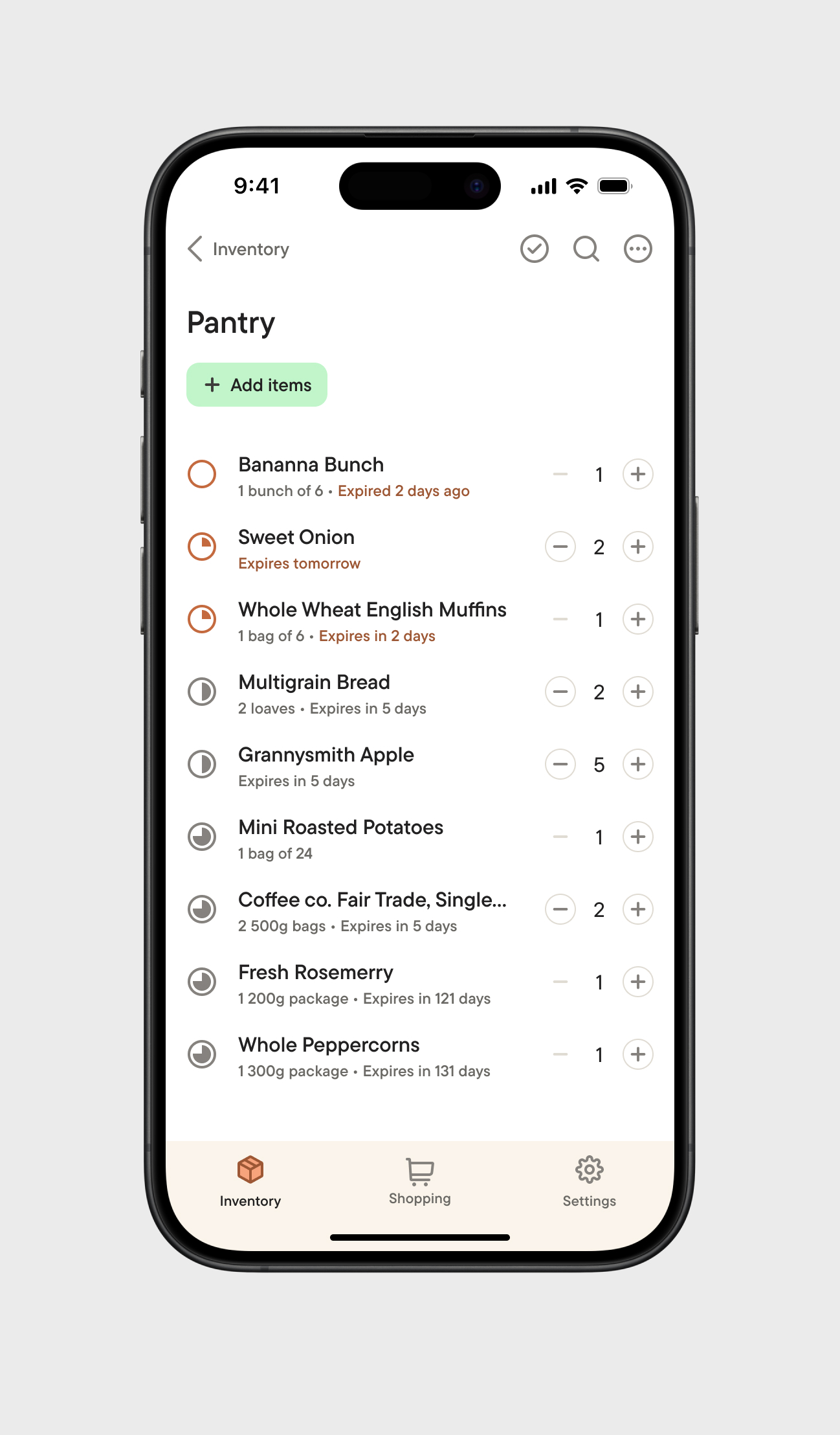
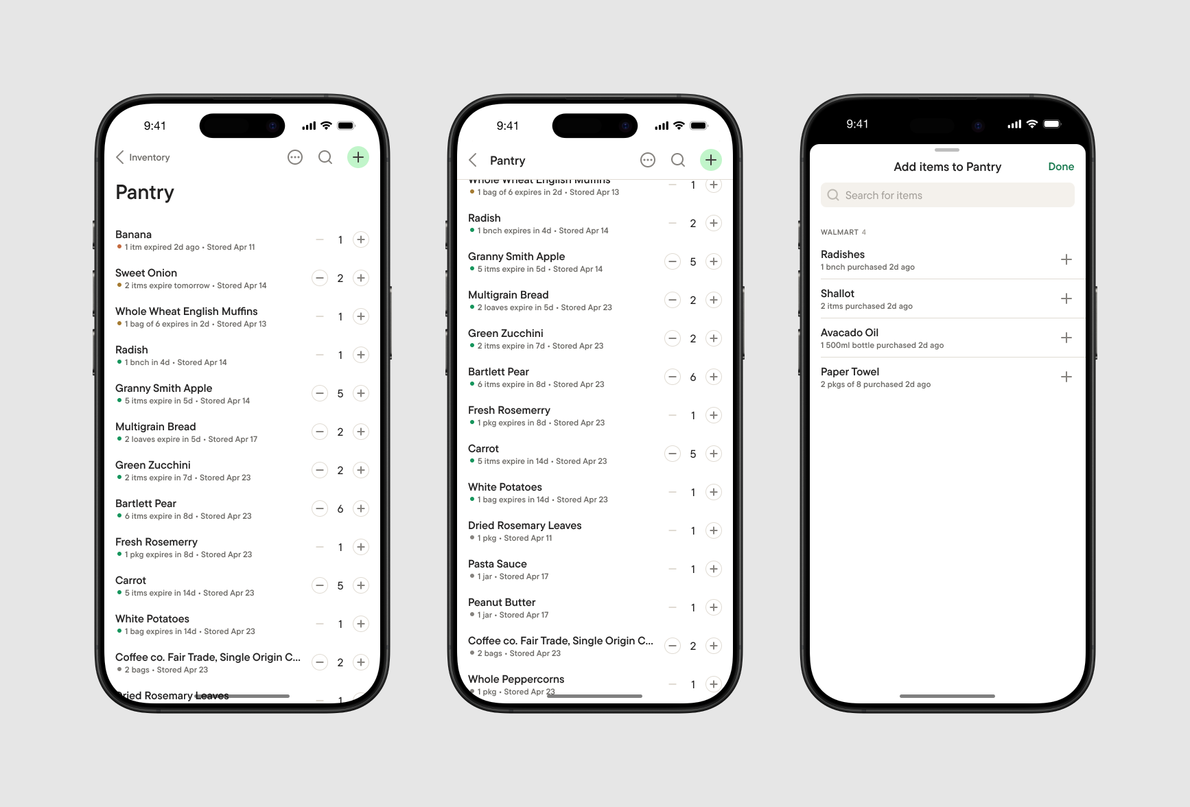
Inventory was designed to give users a quick overview of items stored throughout their household, and the number expiring soon and running low. Common storage spaces (Pantry, Fridge, Freezer, Storage) set smarter default values for expiry dates of items inside them. Users can create additional storage spaces and edit the presentation of lists to suit their needs.
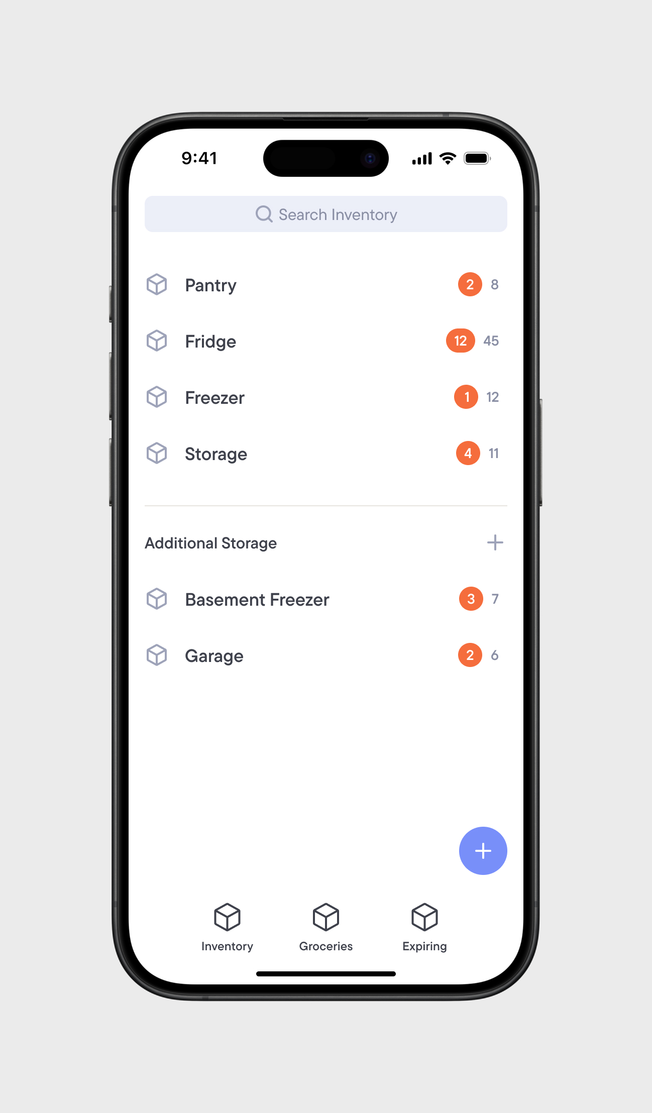
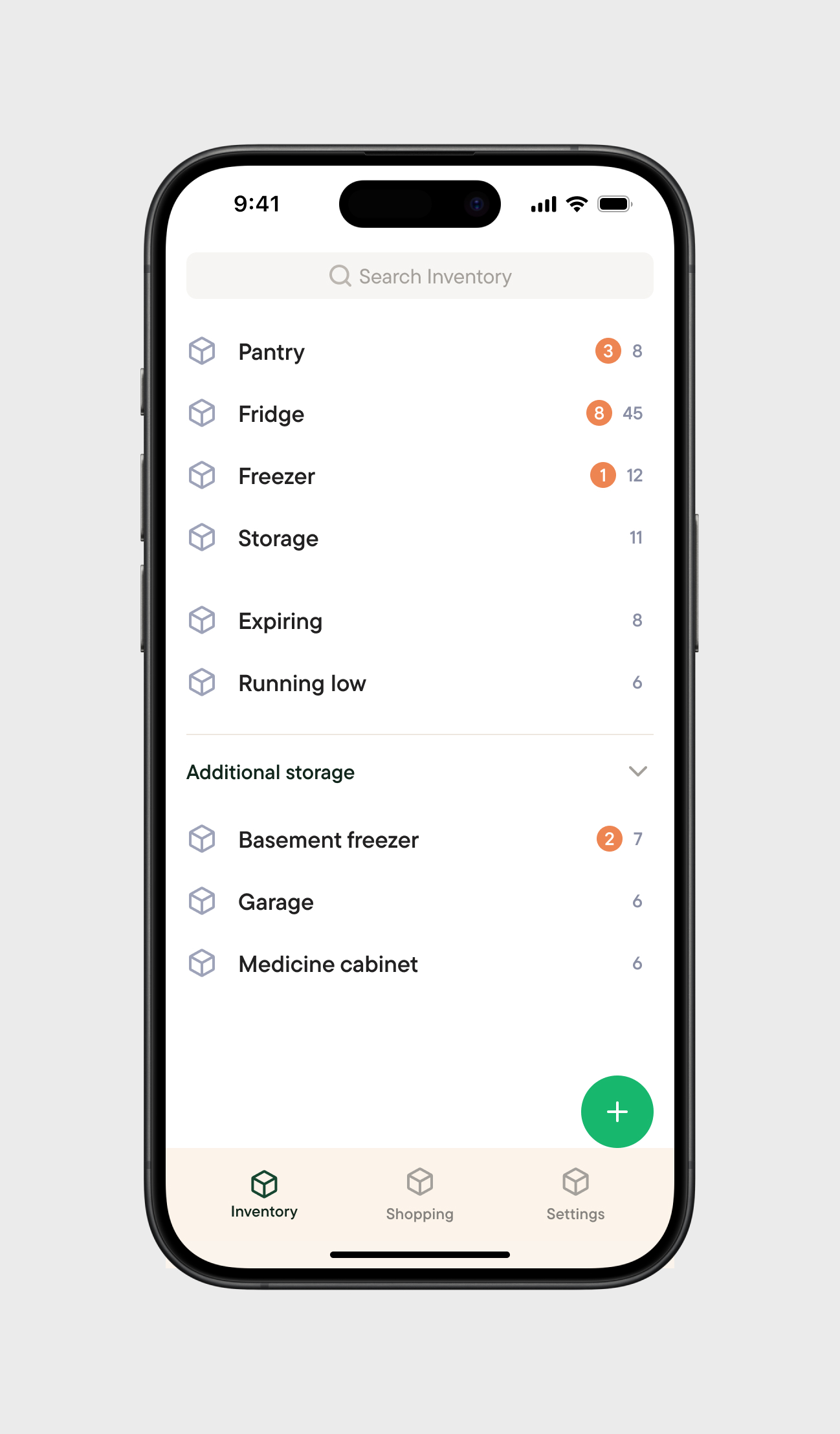
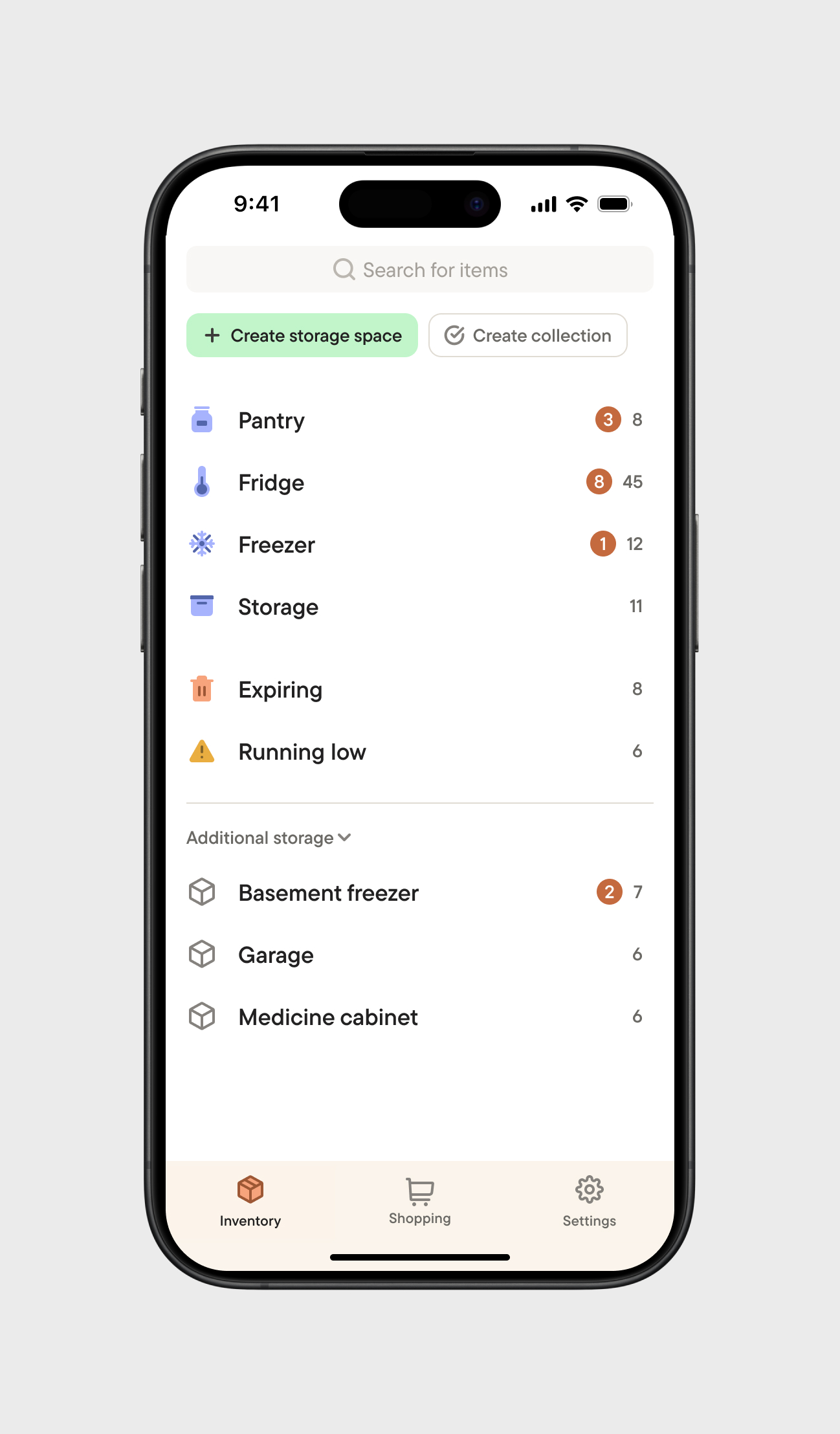
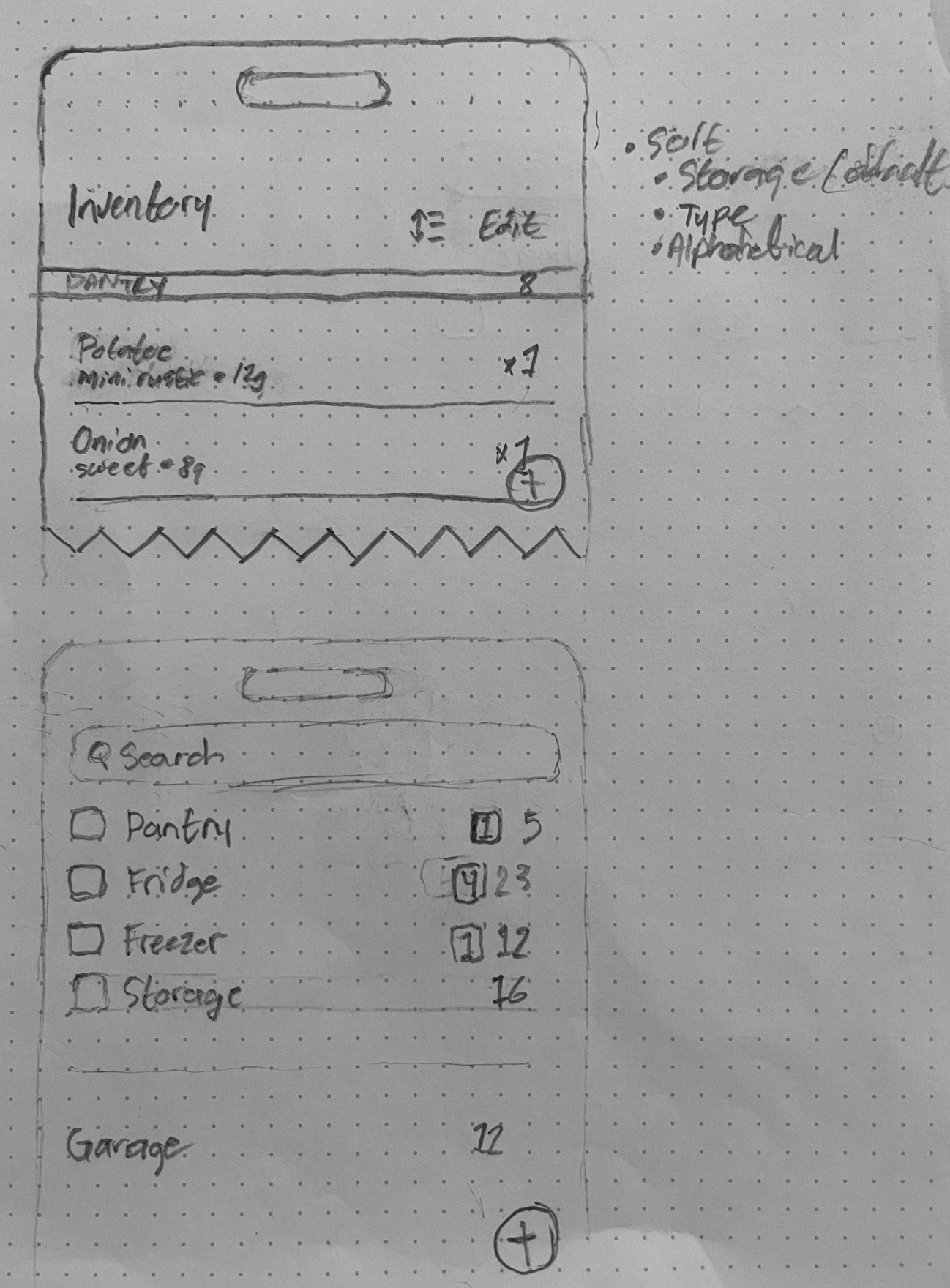
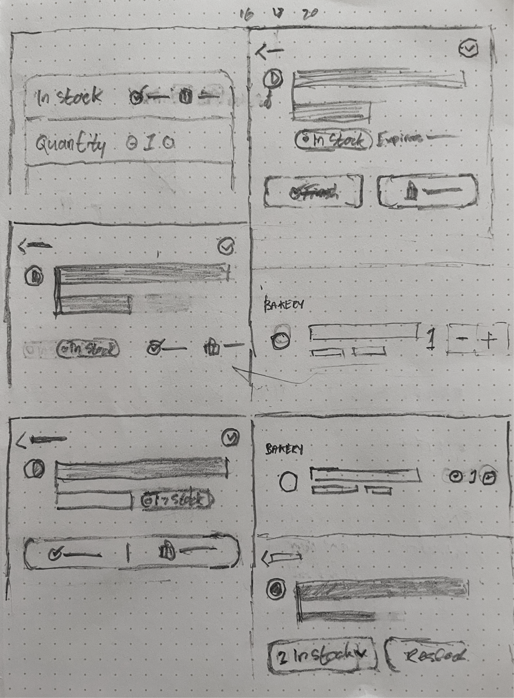
The Inventory page stayed pretty consistent throughout the design process, but these images reflect the evolution of design patterns and components like the Page Header. Originally, I designed a floating action button that would enable users to add items to any storage space from anywhere within the app, but later abandoned the idea when Quantity was added to storage spaces and shopping lists since they occupied the same space. Page-level actions were reduced to a row of icons in the Page Header, and the idea of storage space "Collections" was discarded in favour of a simpler list of additional storage spaces.
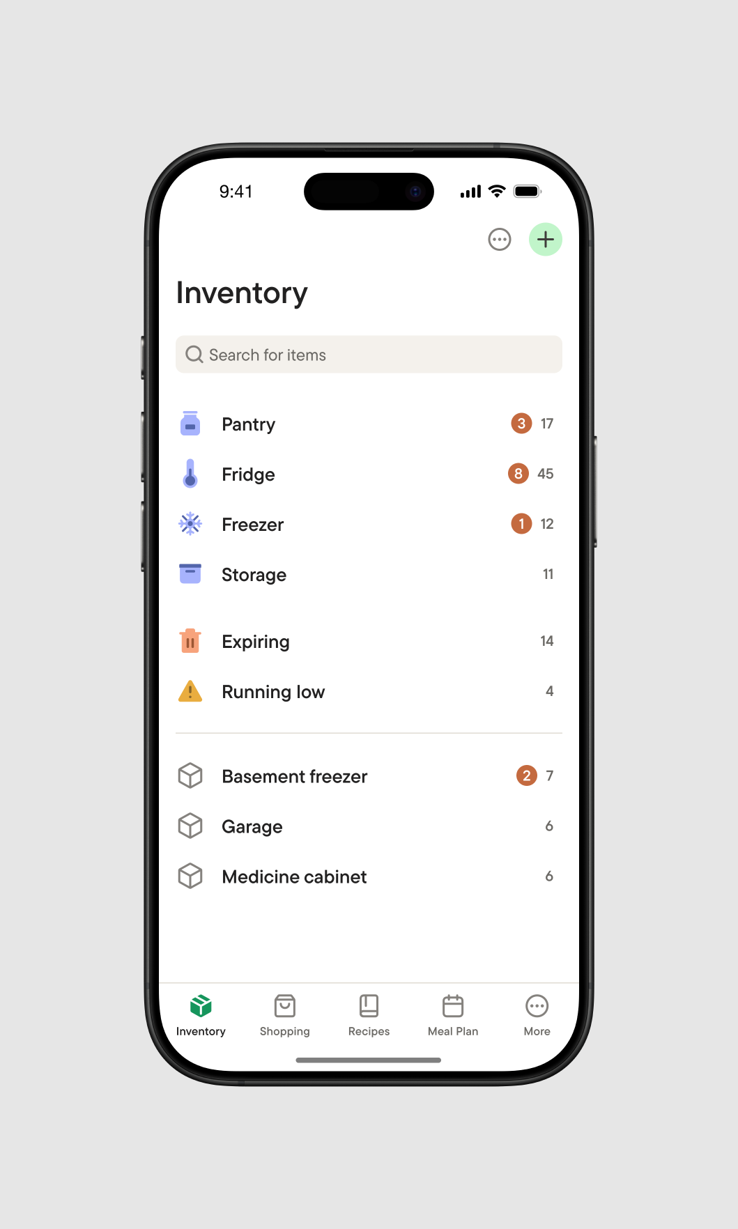
Inventory screen.
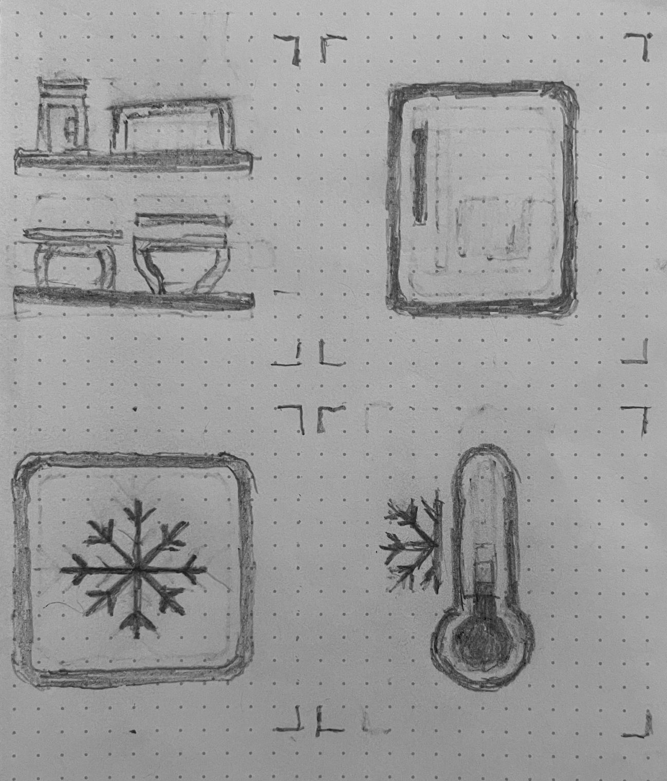
Custom (24px) icons created for storage spaces.
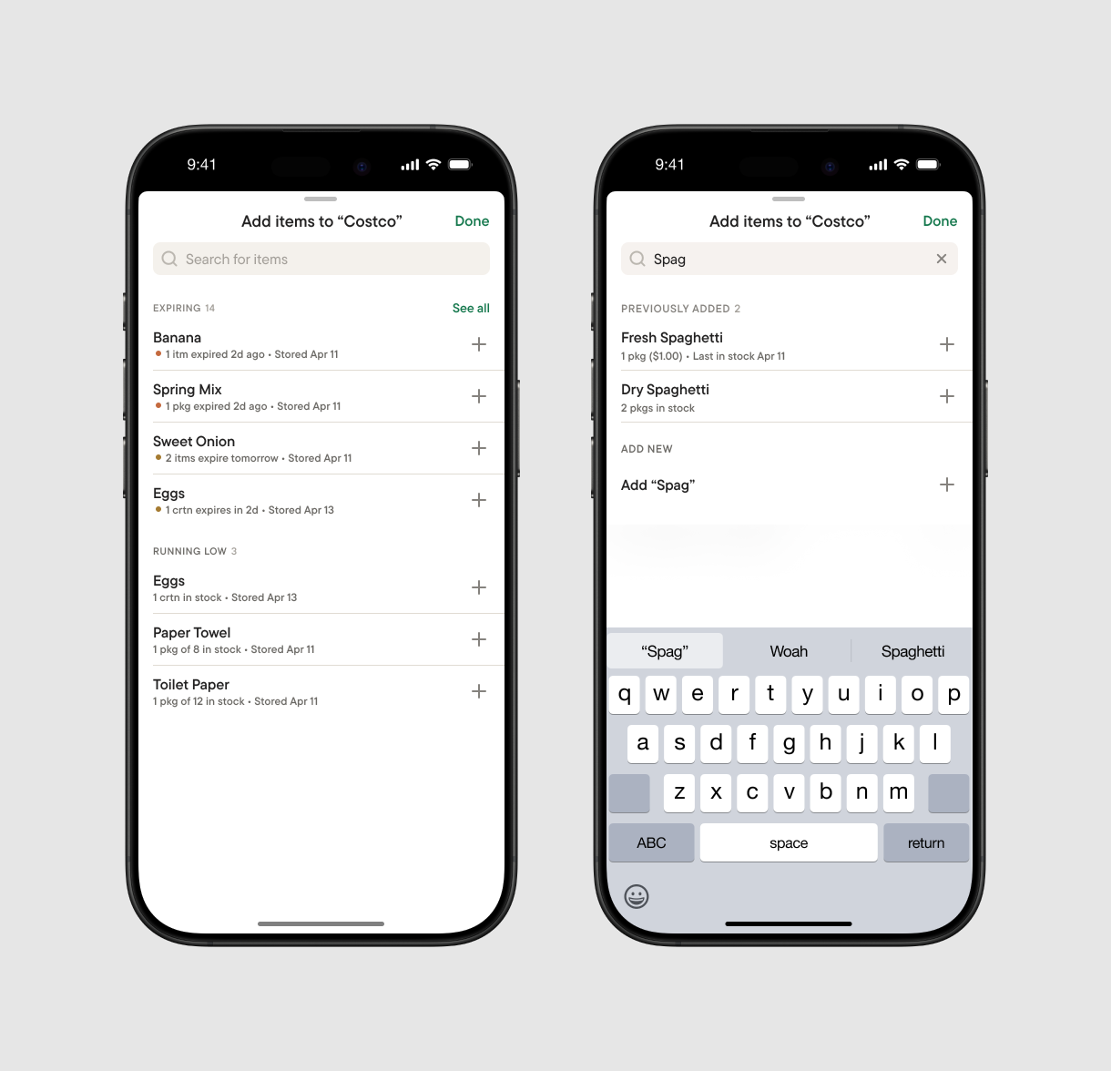
Enabling users to quickly add items
A modal for adding items offers actionable suggestions before the user starts to search that aim to both anticipate users' needs and inform them of the stock within their household. When adding items to a storage space, suggestions to add items purchased from shopping lists that are not yet stored appear, and when adding items to shopping lists, items that have their expiry or stock tracked. As the user searches, previously added items appear that retain previously entered data, as well as the option to add a new item.
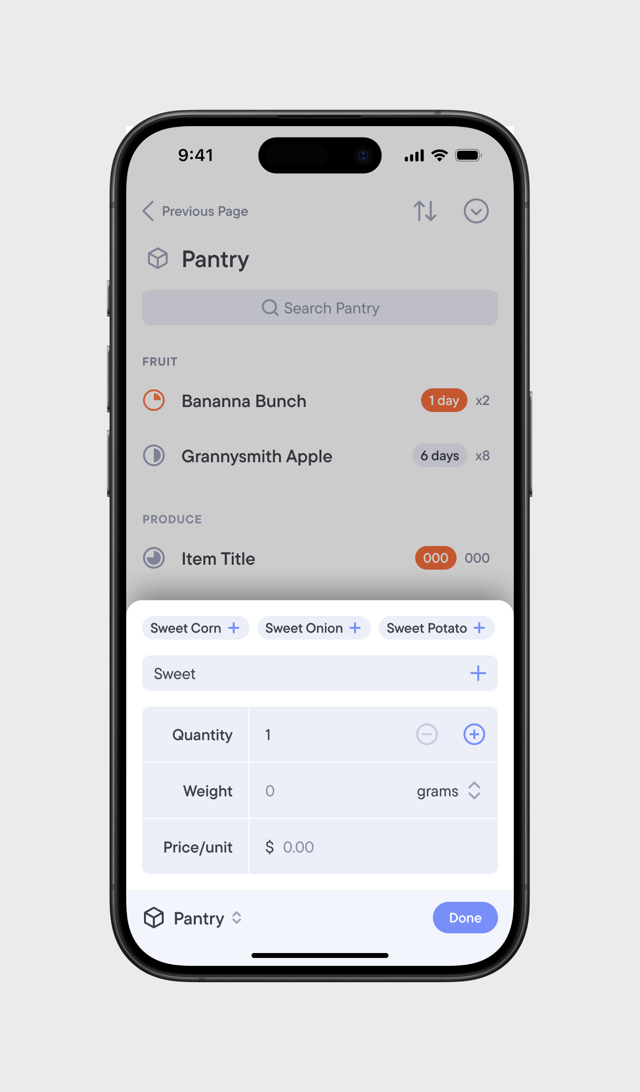
I went through many iterations on the experience of how users would add items to a storage space or shopping list, centred around the question of how much data should be required to enter before an item can be added. It was a given that items would need a name, but otherwise, should they only have to enter the quantity? Should the price field also be surfaced? Should all item details be presented? The main trade-offs to consider the ability to add multiple items vs a single item, and adding items quickly vs. the visibility of all item details, being able to enter everything at one time. Then, it hit me.
Quantity should be added storage spaces and shopping lists themselves.
By adding the quantity field to the storage space and shopping list pages themselves, it not only meant that only a name would have to be entered when adding items, but also that item quantity could be easily adjusted inside of storage spaces and shopping lists. After they are added, items can be further detailed or modified.
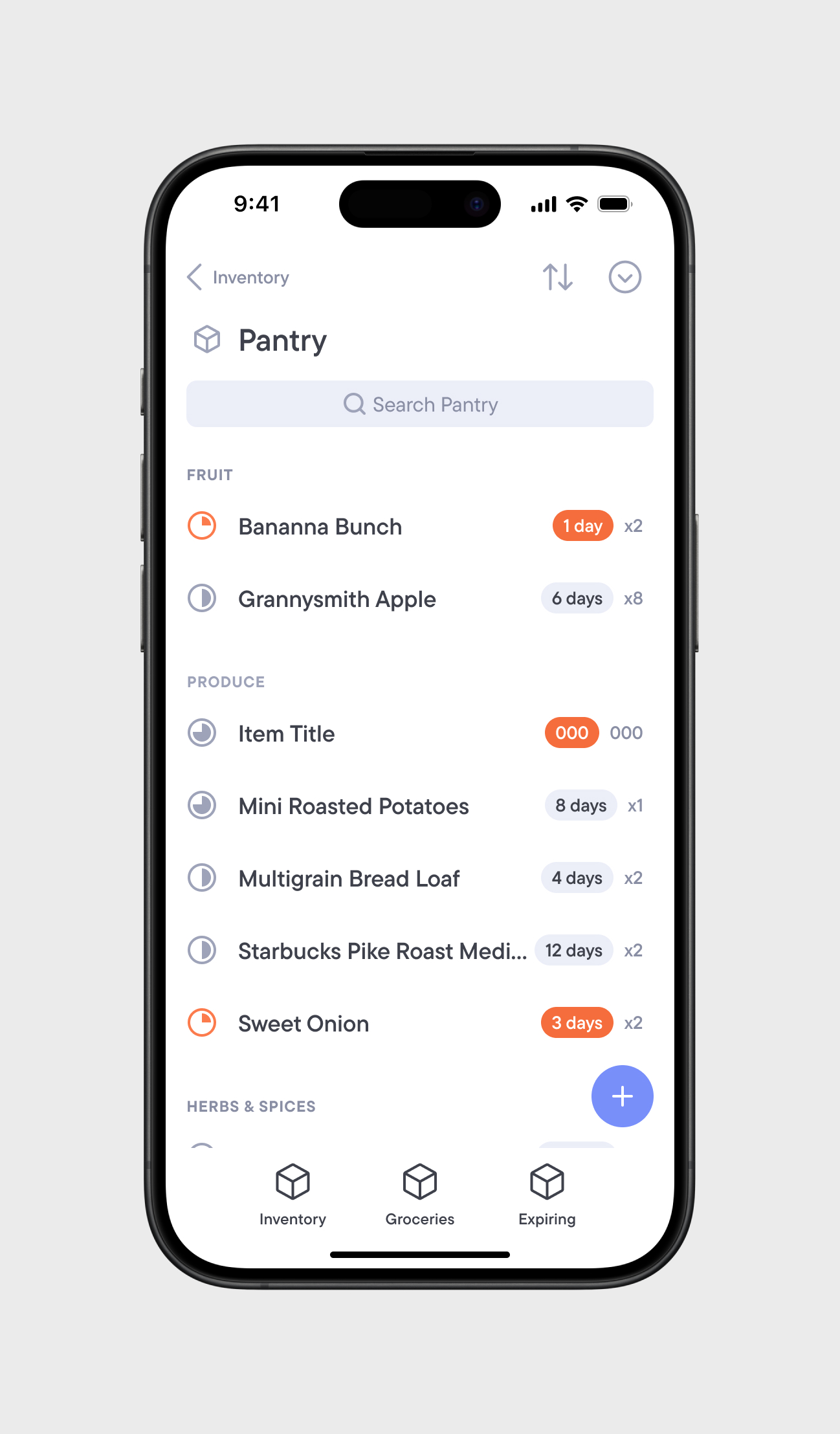
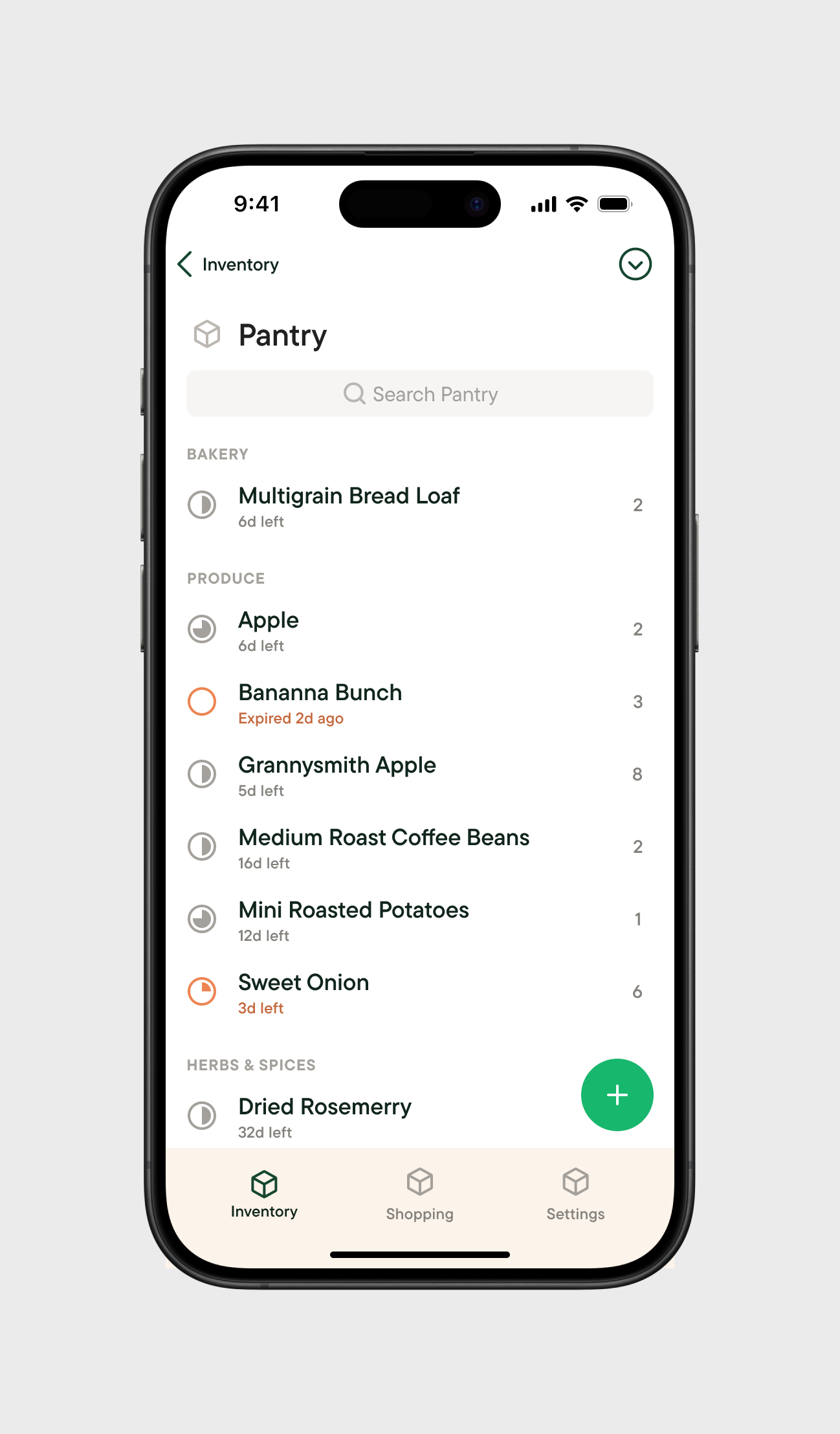
Pantry (storage space) Details and Add Items modal screens. Headers become compact when scrolling.
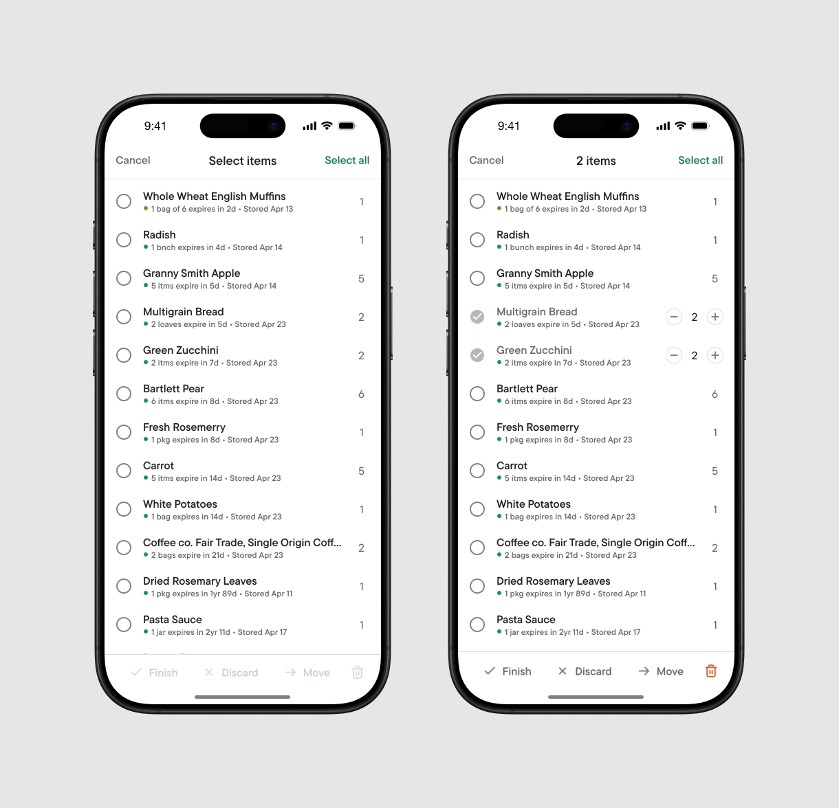
Inventory Details (Pantry) batch commands modal (default and selected states).
Making items smart and reusable
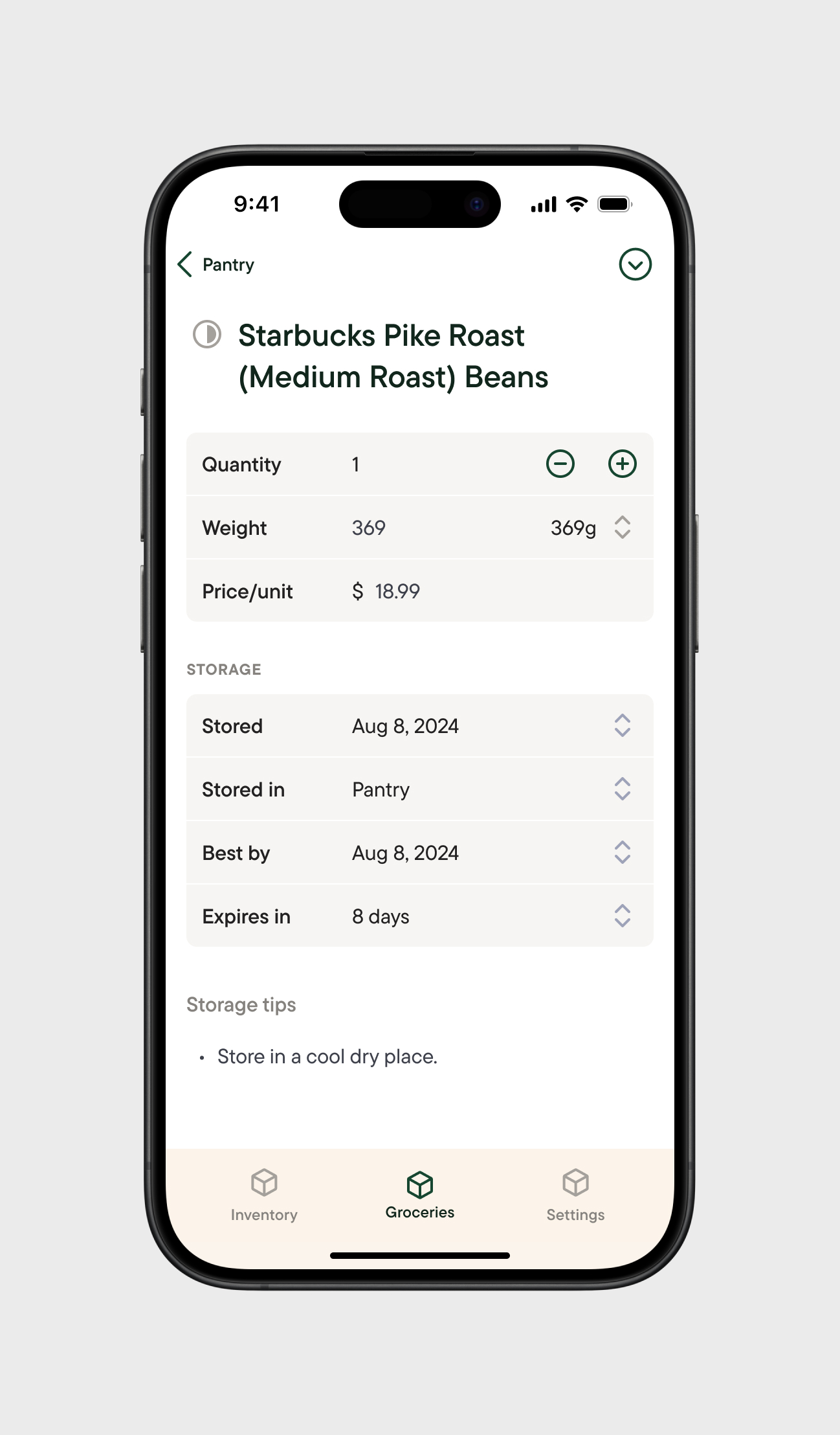
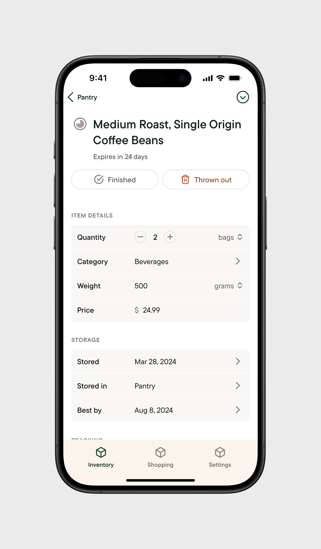
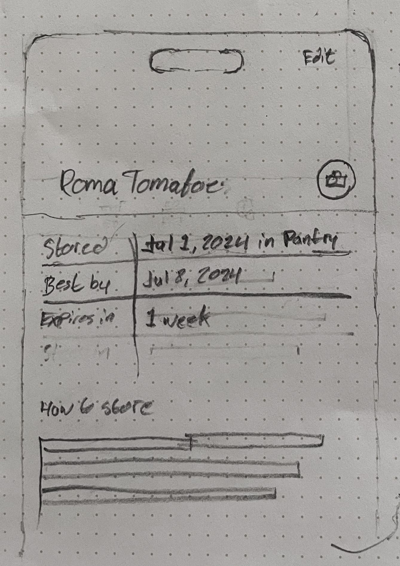
Item details are viewed by tapping an item inside a storage space or shopping list. When all of the quantity of an item is consumed or used, items that expire can be Finished or Discarded, removing it from the list, and logging that data to help users track their progress towards their goals of reducing food waste and saving money. Items that don't expire have a "Used" action instead. Item expiry and stock can be tracked separately for all items – tracking expiry for an item will notify users that an item is expiring soon, and tracking stock will add an item to the Running Low list once it reaches a set amount, as well as surface items as suggestions by default when adding items to shopping lists.
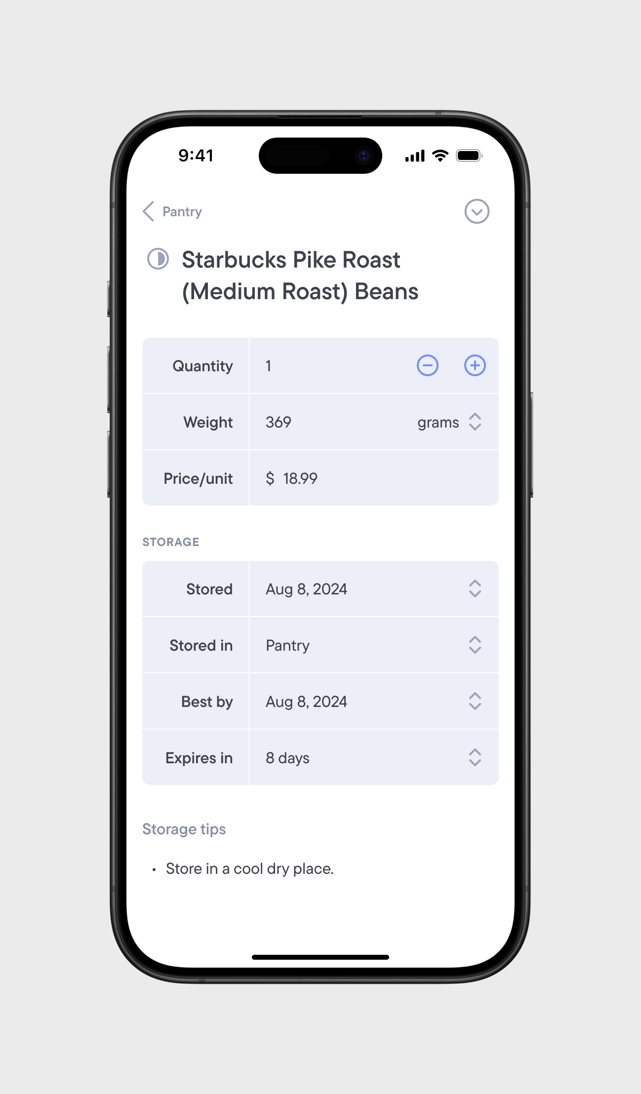
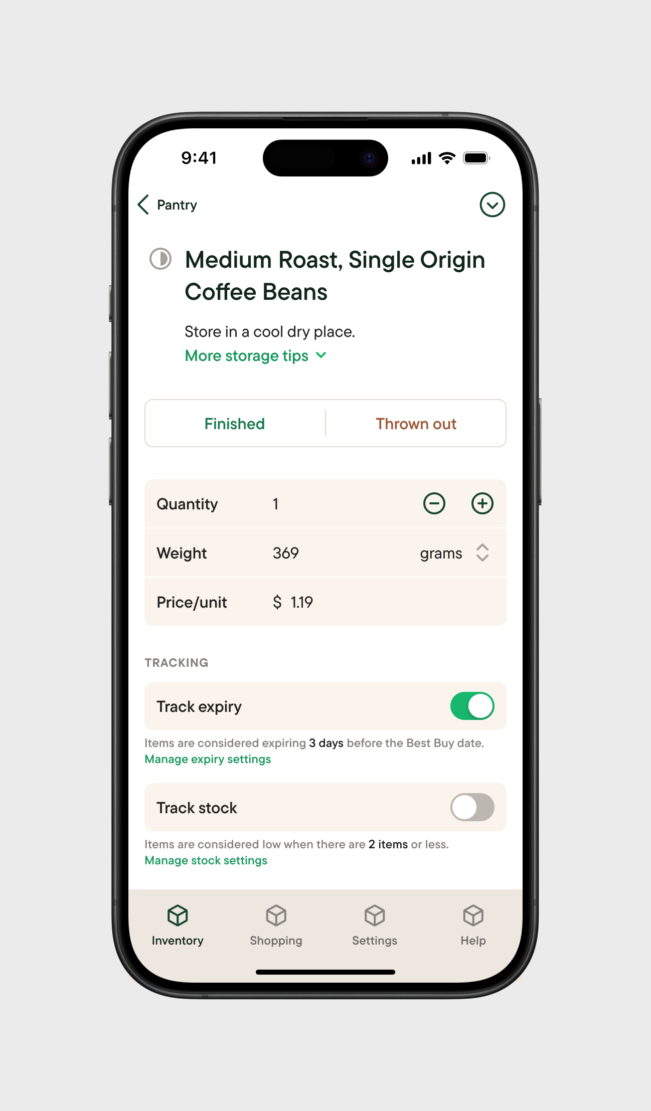
Although one of the main aspects of the app was tracking item expiry, I knew I also wanted to support both perishable and non-perishable items, since keeping track of the stock of regular household items was an important use case. This introduced more complexity into the app, and it made it tempting to treat items all items the same way to avoid the challenge.
Simultaneously, deciding the direction stock tracking should was a challenge: there was a push and pull between it being more informational or more rigidly tied to actions. On one hand, I liked the idea that users follow a sequential flow – users could "Open" an item (potentially linking to item expiration), "Consume" an item (reducing stock), or Finish/Discard an item (removing it from inventory). This flow would also reenforce that users should only be reducing stock and removing items from the list and re-adding the same item when re-stocked. But, this solution felt too complicated, and provided little benefit compared to a simple count of stock.
The key to solving my dilemna lied with the Expiry Date field.
I felt like I landed on a solution that was the best of both worlds: the stock of an item would be purely informational, and I could provide contextual actions for the user to take that would remove the item from a list. The stock of an item would be a count that could be increased or decreased at will (with a minimum of 1). "Finished" and "Discarded" buttons or a "Used" button, depending on if the item had an Expiry Date set, would serve as the main action to be taken on items.
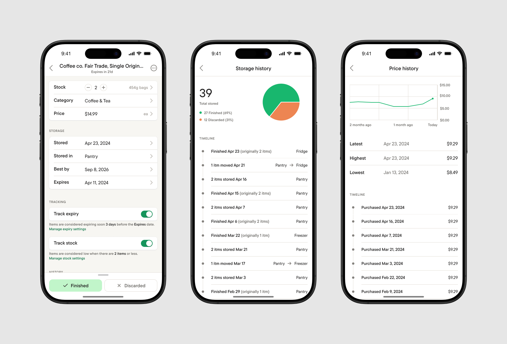
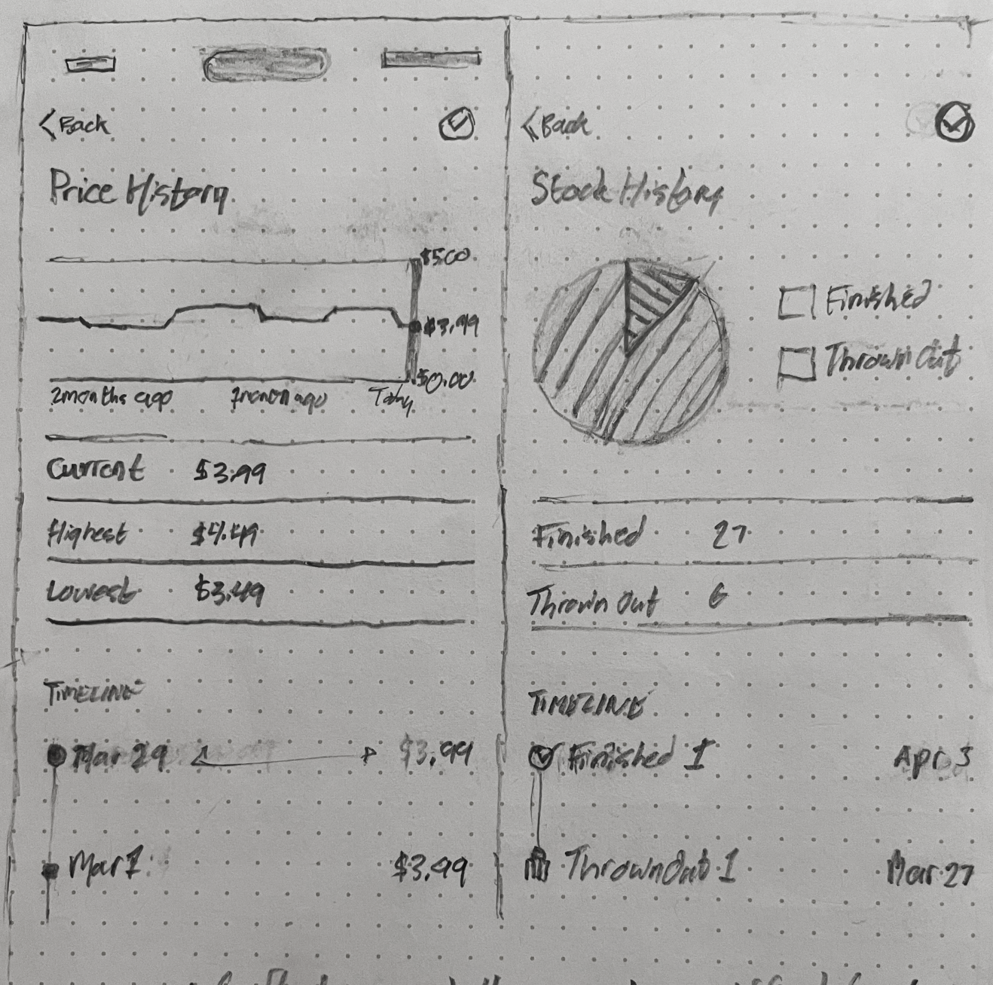
Item Details (Inventory) screen, and interior Storage and Price History screens.
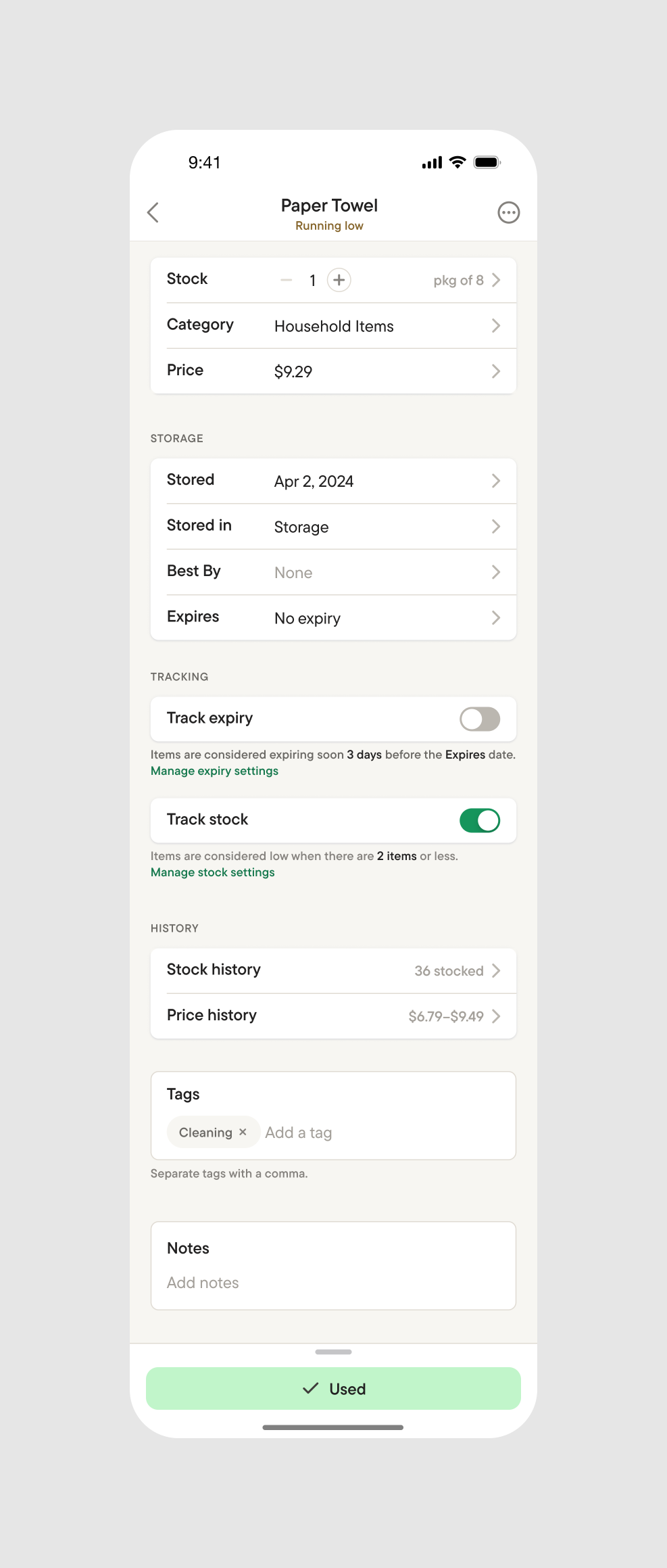
Full Item Details screen.
Optimizing shopping lists for groceries
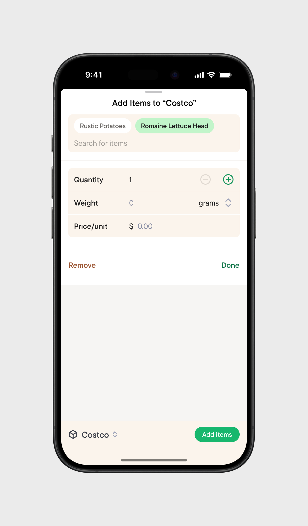
Shopping allows for both scheduled one-off and recurring lists. Shopping lists are sorted by item category by default that can be re-ordered. Adding items to shopping lists utilizes the same modal design pattern as with Inventory, allowing for quick and familiar list creation. As items are checked-off, they are moved into a "Ready to Store" category that appears at the bottom of the list, keeping the user's focus on remaining items. When a user finishes shopping, they complete the list and are presented with a modal allowing for storage selection of each item.

Shopping lists, Shopping List Details, and Item Details (shopping list) screens.
Add items to shopping list modal (default and typing states).

Shopping List Details (scrolling) screen, Shopping List Details (completed list) screen, and Store Items modal.
Get creative with your ingredients
Browse recipes published by other users and save them for later, or create your own recipes. Recipes can be filtered by a number of different criteria including using the ingredients you have at home.

Recipes (Browse tab) and Recipe detail screens.
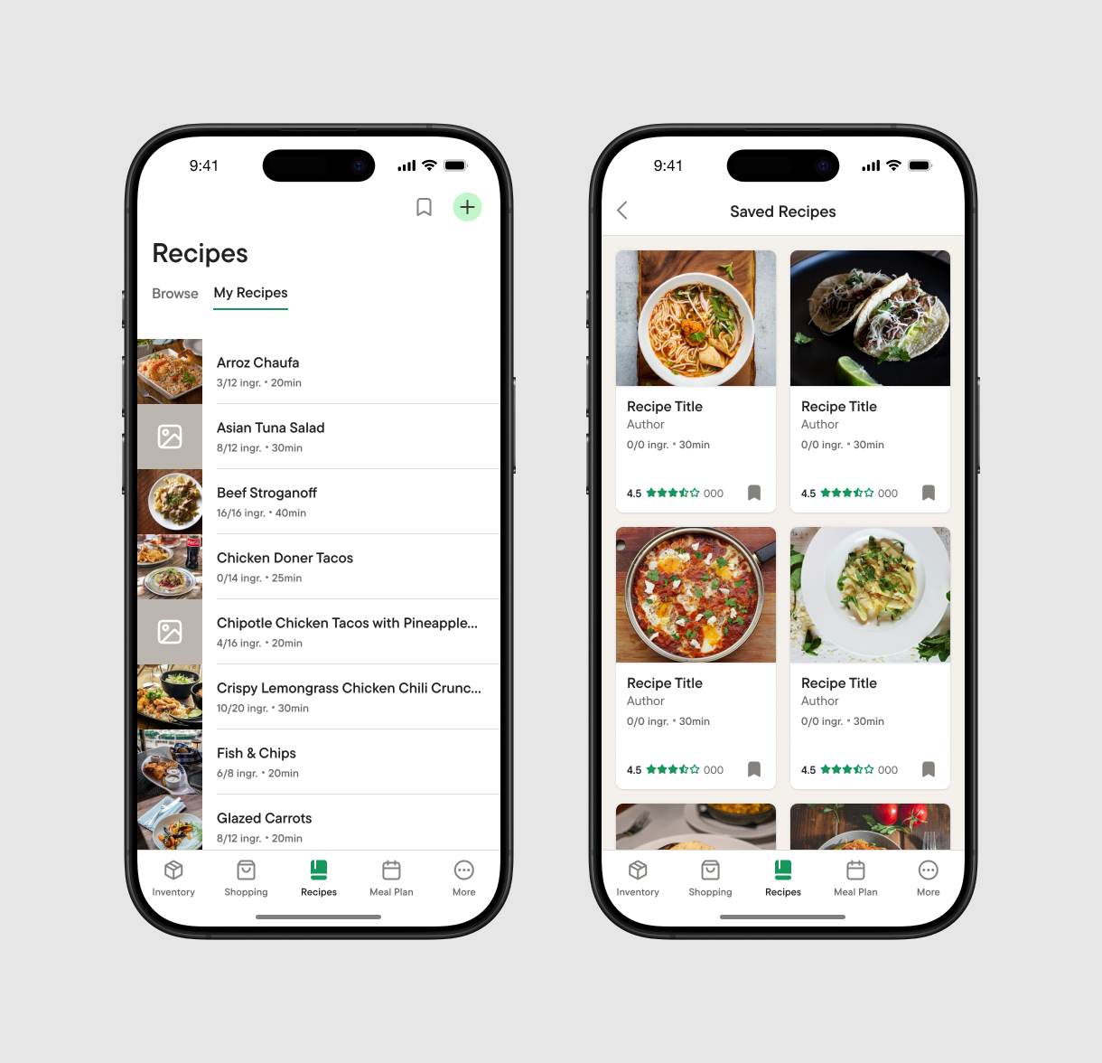
Recipes (My Recipes tab) and Saved Recipes screens.
Roadmap
Settings/Help screen designs
Recipes features screen designs
Meal Plan feature screen designs
Figma prototype
Dark mode
Full brand identity including product logo
iOS app assets
Common Items development
Version 1 iOS development (Inventory, Shopping, and Settings)
Family Sharing feature
Barcode scanning feature
Print lists functionality
Meal Plan feature development
Recipes feature development
watchOS app design and development
More ;)